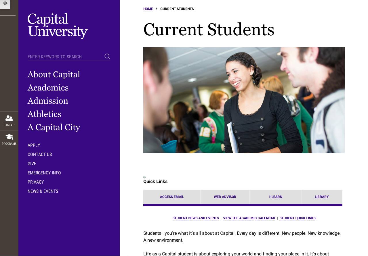
 photo provided by Nichole Johnson
Plans to launch the new website over Christmas break were disrupted after the U.S. Department of Education requested to review the institution’s compliance with federal education requirements.
“They asked for hundreds of pages of documents and URLs from the current website that demonstrate what our practices, protocols, and policies are with regard to really almost everything that the university does,” Director of Media Relations and Communications Nichole Johnson said. “Given the size of the request, and [the] late notice of it–at least given its proximity to our deadline for launching the site–it was decided that [the launch] was too much of a disruption.”
Capital was notified of its random selection on Dec. 17, two days before closing for winter break.
Johnson said delaying the launch was a hard decision for her web team, who had worked hard on getting the site ready by Dec. 26.
While Johnson must float the exact date within Capital’s various departments, the launch is now targeted for some time during spring break.
“We try to do anything major when there’s a natural break in the flow of the semester, so as to disrupt business practices the least,” Johnson said.
The two main goals of Johnson’s web team are to roll out a world-class website that reflects the university’s identity and supports the needs of its audiences.
Capital last updated its website design in August of 2011 and Ektron, its content management system, in 2012.
While it’s common for most institutions to update their websites every three to five years, one may wonder why Capital decided to embark on the $250,000 project now.
“I think we all know mobile technology is not just the future, it’s today,” Johnson said. “If we are going to maintain our relevance as a university, we have to be findable, and [we] have to present the information on our site in the environment of the user’s choice, whether that’s a smartphone, tablet, or some device that doesn’t even exist yet, regardless of the browser.”
Unlike the existing website, which doesn’t display certain content on some devices and requires smartphone users to frequently resize webpages, the new website is “extremely responsive.”
According to Johnson, the website will also give Capital a chance to streamline content and ensure that its navigational structure is more intuitive to users.
Prospective students, for instance, search the site differently than someone who has already familiarized themselves with Capital, Johnson said. The website prioritizes three main audiences—prospective students and families, current students, and employees—creating more navigational options.
The menu structure is broken down into three options: topical navigation, audience classifications, and task specific quick links.
Before Christmas break, Johnson conducted a focus group with 10 current students. They were asked to navigate to their top five destinations and then compare the existing website to the new one, specifying how their digital experiences could improve.
Taking the study’s findings into account, the students tab will feature a quick links bar to content students found most important: Webmail, WebAdvisor, iLearn and Library.
According to Johnson, when asked to characterize the new website, students said it was more “modern,” “intuitive,” and “easier.”
Referred to as one of Capital’s Improvements Projects, the new website is seen as an investment in the university’s assets and is expected to grow from ongoing content development.
Capital hired two partners for the project: mStoner, a firm considered to be a thought leader in higher education web design, and Square Root Interactive, a firm specializing in deploying Ektron.
“Once we launch, it’s a beginning of a conversation,” Johnson said. “We’re really trying to design a site that will not only meet our needs this year or next year, but five years from now.”

